

Mateo's in Motion
A website to serve independent delivery route owners by offering staffing, systems, and community
ROLE
Web Designer
TIMELINE
May 2025
TOOLS
Figma, GoHighLevel
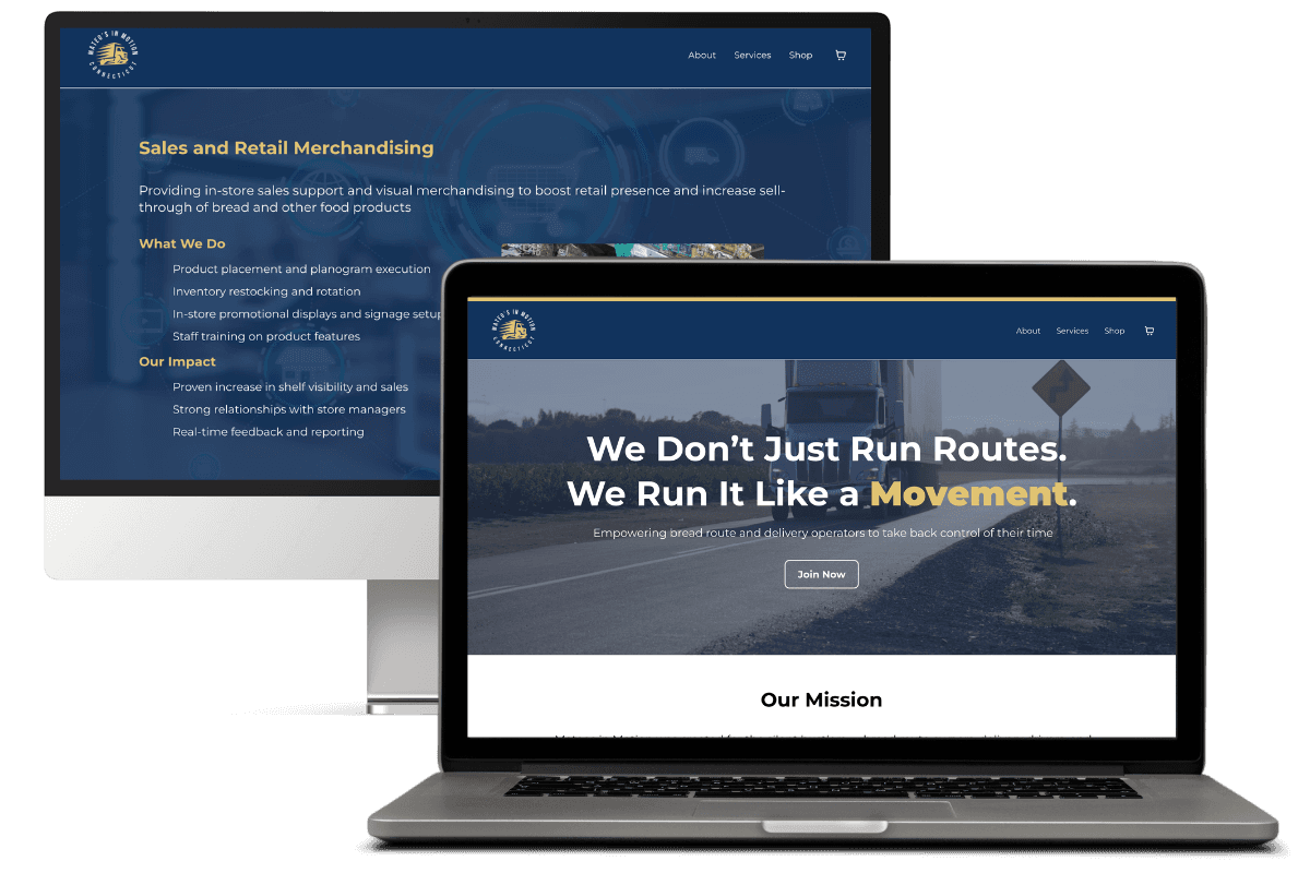
OVERVIEW
Mateos in Motion exists to uplift bread route owners, beverage drivers, snack operators, and independent carriers who work long hours without structural support or scalable systems. The website was designed to establish credibility within this niche audience by emphasizing discipline, legacy, community, and the transformational nature of the brand.
PROBLEM
Before the website, Mateos in Motion lacked a cohesive digital identity and clear explanation of services. Target users struggled to find a resource that both understood their reality and provided structured support.
The design needed to tackle:
Lack of trust with operators due to unclear messaging
Overwhelming industry jargon without human connection
Disjointed service explanation that didn’t reflect the movement-focused ethos
GOALS
Communicate the brand’s identity as a movement, not just a service
Clearly articulate what services are offered
Build trust with a blue-collar, hardworking audience
Increase user engagement with key conversion actions
INFORMATION ARCHITECTURE
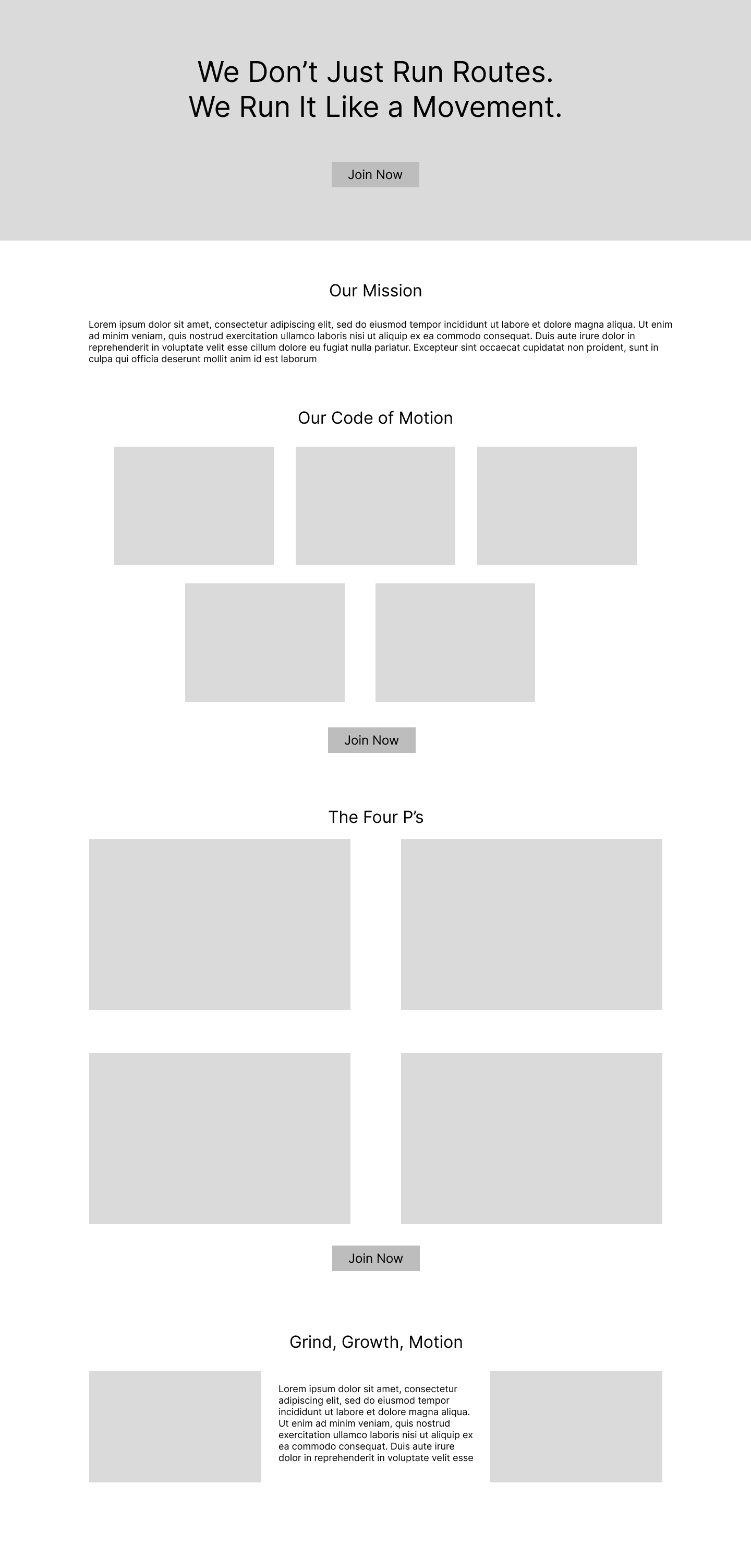
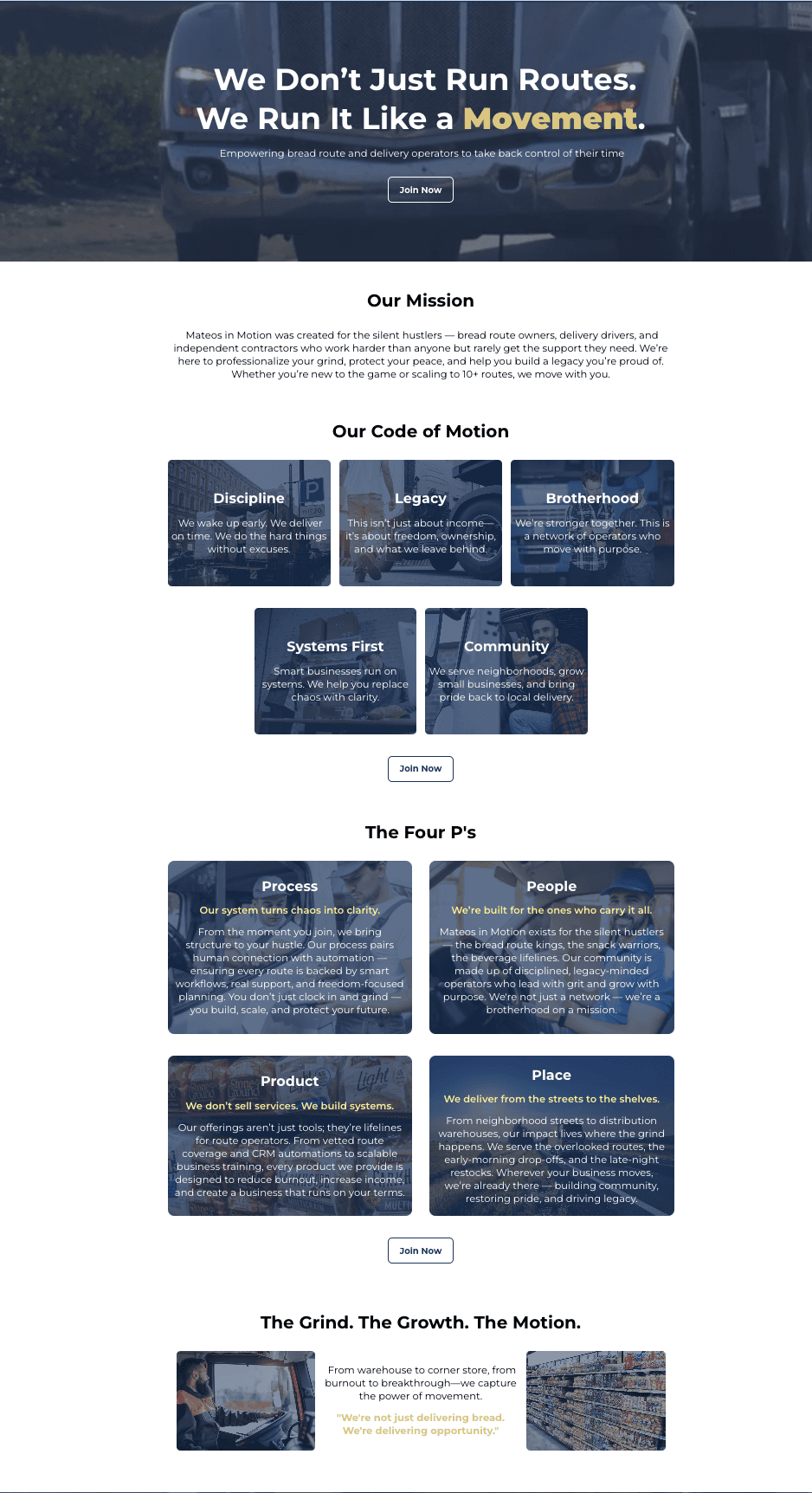
Home – Mission, values, community, and brand
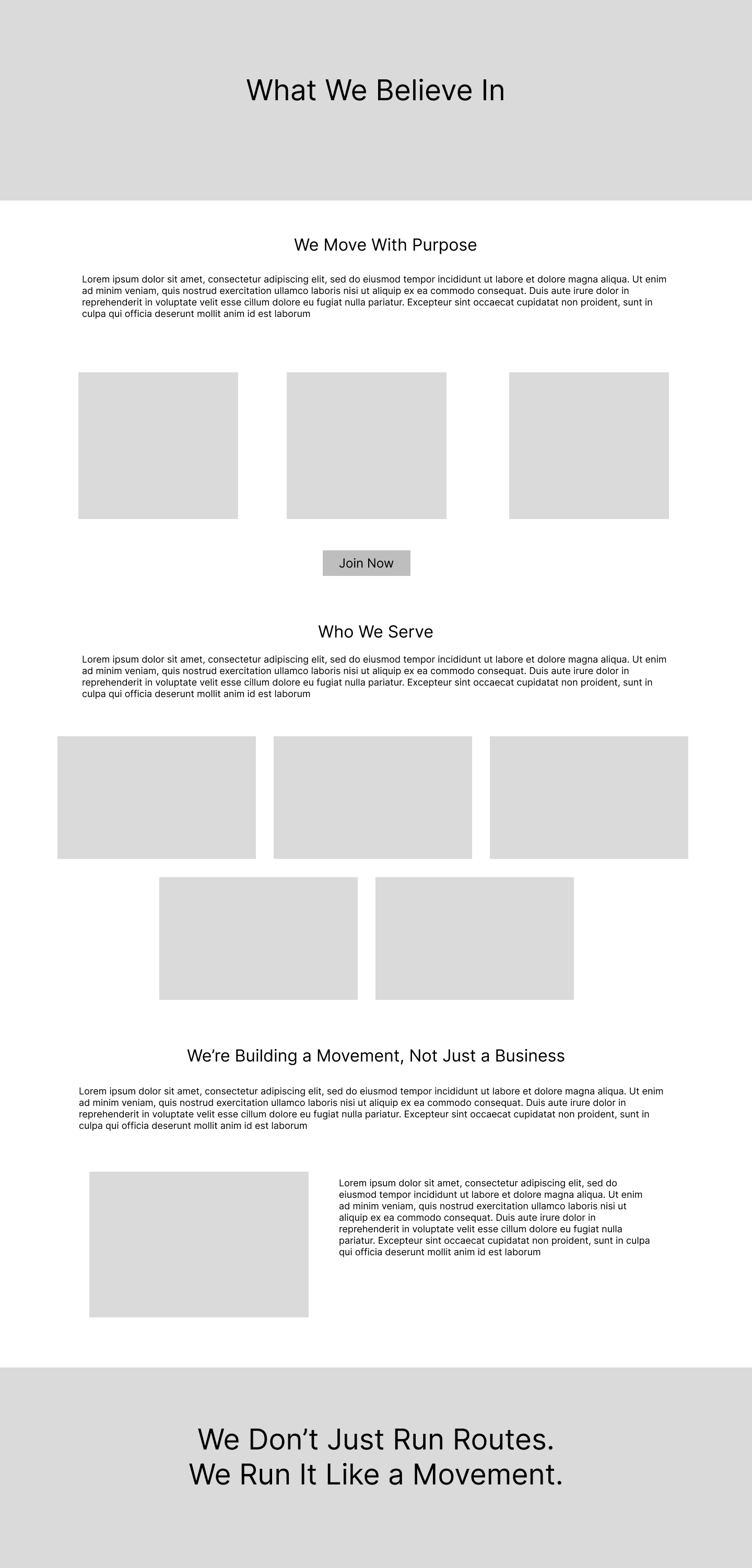
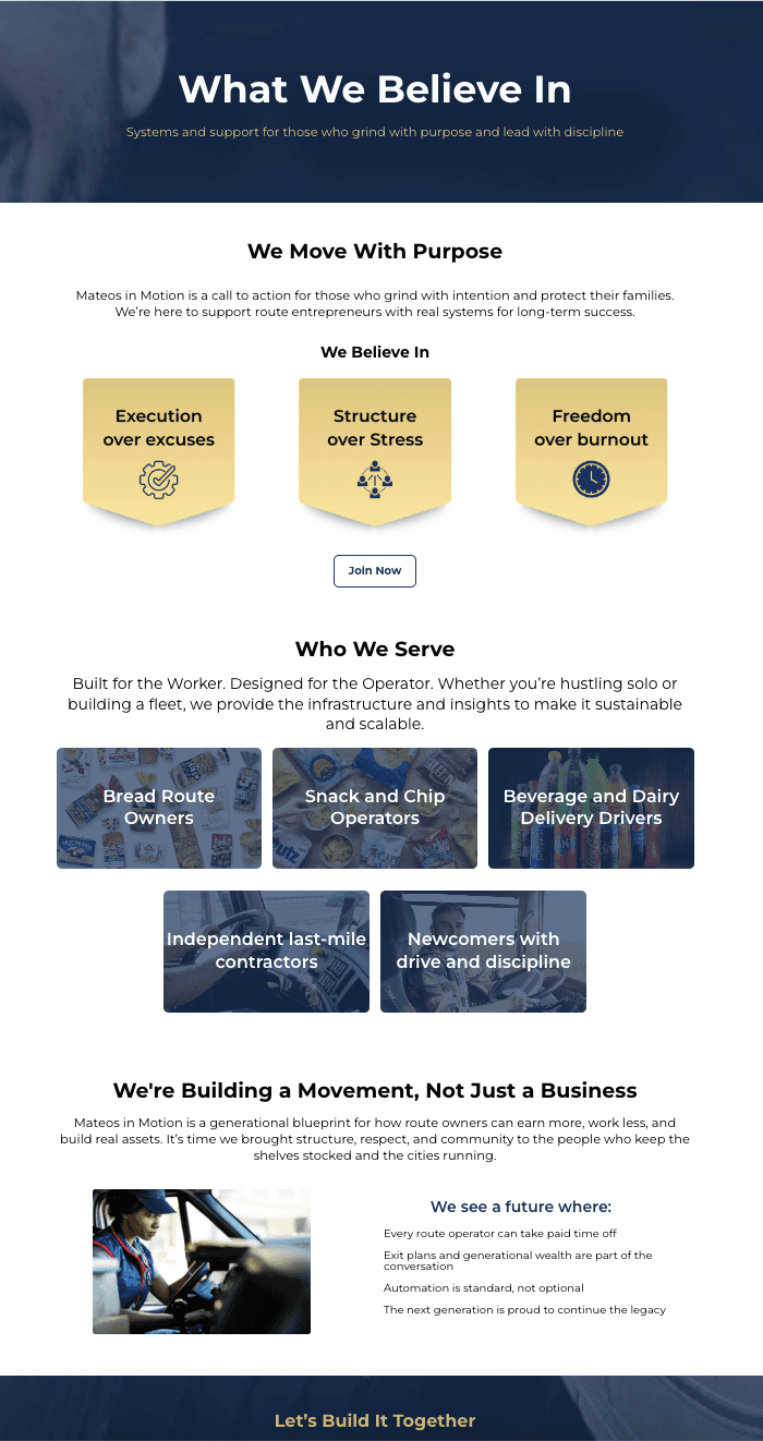
About – Who the service is for and why it exists
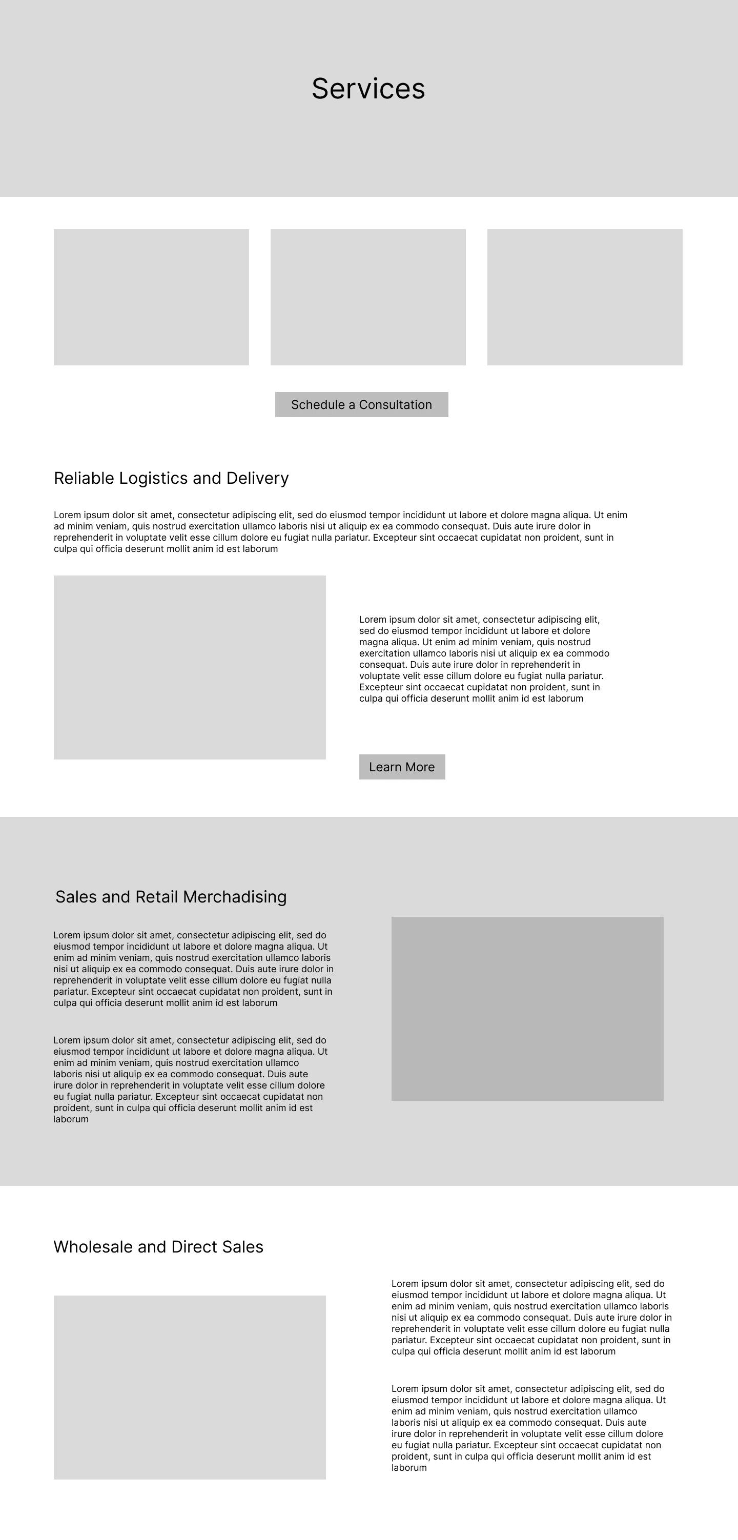
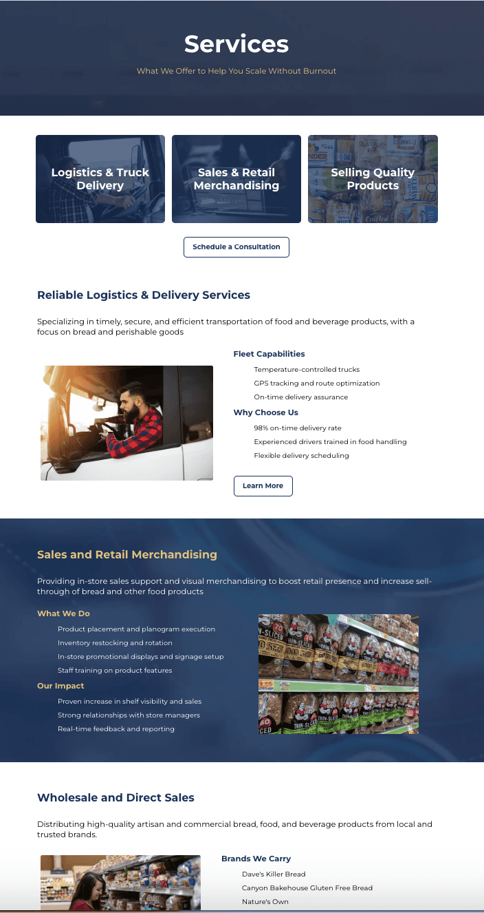
Services – What they offer and how it helps users
LOW-FI PROTOTYPES
COLOR PALETTE
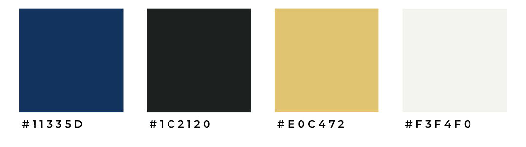
VISUAL DESIGN
Typography: Bold, strong headings to convey discipline and clarity
Layout: Clean, modular sections to reduce cognitive load
Imagery: Real-world route visuals to enhance authenticity
Tone: Warm and respectful language reflecting community
HIGH-FI PROTOTYPES
Home
About
Services
Key features
Mission & Movement Messaging
The homepage clearly communicates the brand’s purpose and values, not just services.
Structured Conversion Paths
“Join Now” and “Schedule a Consultation” CTAs are placed to capture interest at peak moments.
Visual Hierarchy
Bold typography for strong headline contrast
Clear spacing and grid structure for readability
High-contrast call-to-action buttons
Consistent layout rhythm across sections
Design System Thinking
Consistent typography scales
Spacing rules
Reusable button styles
Modular content sections
OUTCOME
The finalized site successfully positions Mateos in Motion as a credible, movement-oriented brand with a clear value proposition. The structured layout and emotional storytelling create trust with operators while guiding them toward conversion actions. The site also provides a strong foundation for future expansion of offerings.
This project strengthened my ability to design for niche audiences using both narrative and systems thinking. I was able to better
Translate business goals into structured web experiences
Design with hierarchy and conversion in mind
Think modularly and systemically
Balance visual design with usability