


Transforming visitor information access to foster connection
A kiosk platform unique to the Balboa Park Botanical Building to learn plant information, architectural insight, and visitor community.
CONTEXT
A San Diego landmark
With over a century of history and over 300 species of plants, the Botanical Building at Balboa Park has been restored to preserve structural integrity and historical charm.
PROBLEM
A lack of information access
Visitors and tourists struggled to identify plants and access related information due to minimal on-site signage. The architecture and structural materials, which are key features of the century-old building, often went unnoticed, limiting opportunities for deeper appreciation and engagement.
50%
of visitors didn't know the specific plant names or building history after visiting
SOLUTION
An interactive guide to explore the building
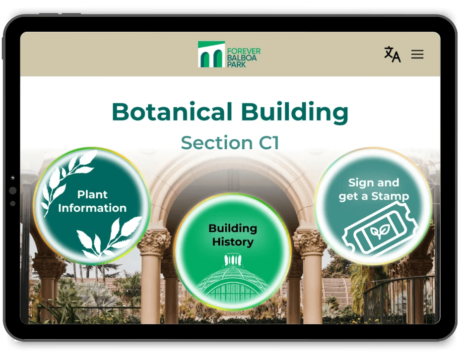
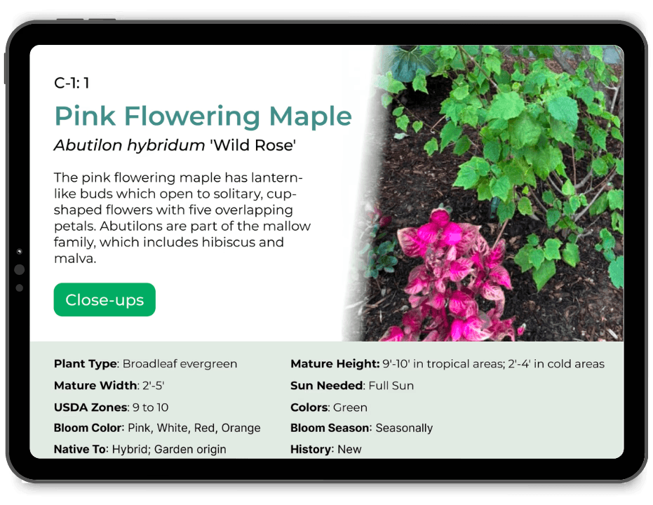
Plant identification and information
Visitors can use the section plant map to find the plant they were looking for. They can find relevant plant information and interactive close-ups.
Building architecture and history
Visitors can explore different parts of the building and learn about the specific history. They can also find photo spots for the related areas.
Visitor scrapbook
The digital scrapbook allows visitors to select their favorite plant and add their name, strengthening their connection to the building.
RESEARCH
Understanding visitors with fieldwork, interviews, and surveys
We learned from staff and visitor perspectives at the Balboa Park Botanical Building, uncovering pain points around plant identification, building renovation, and access to information. By listening to their stories, we aimed to identify unmet needs and evaluate existing solutions to inform opportunities for a more engaging and accessible experience.
Painpoint: too many steps to find plant information

Analyzing interviews and survey responses
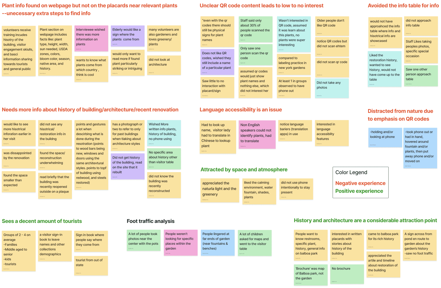
Based on the 5 interviews with staff and visitors and 10+ visitor survey responses, we analyzed the data into an affinity map.
Lack of plant identification
Little plant signage and many steps after scanning the QR code
Not enough building history information
Many people weren't aware that the building was recently renovated
Left with a memorable visit
Visitors engaged with building, took photos, and signed the phyiscal scrapbook
IDEATION
Initial explorations
Based on the research insights, we focused on 3 features: plants, architecture, and a scrapbook
User journeys
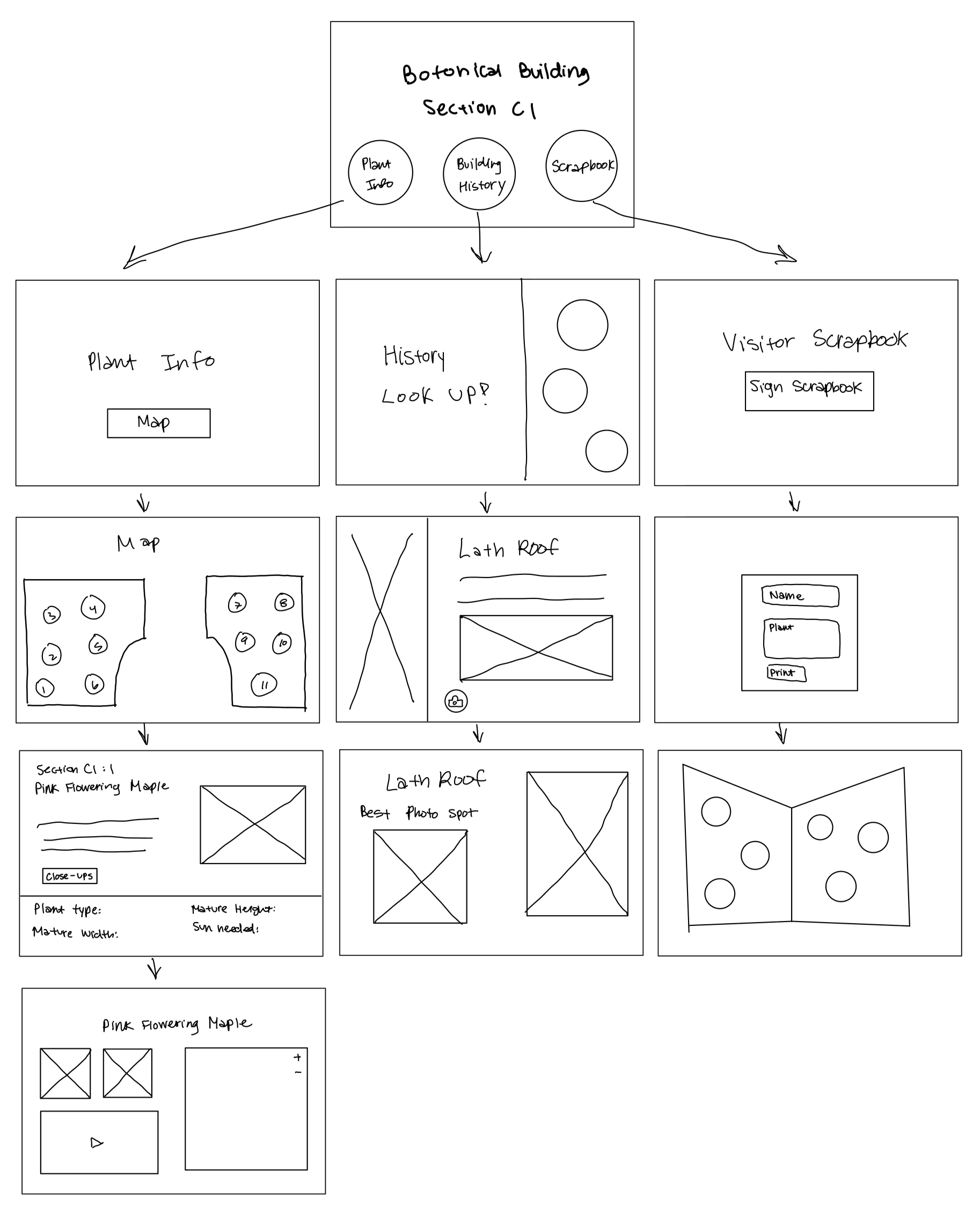
I created the user journeys to map which screens were necessary in the prototype and how the 3 features connected with each other.

Low-fidelity prototypes
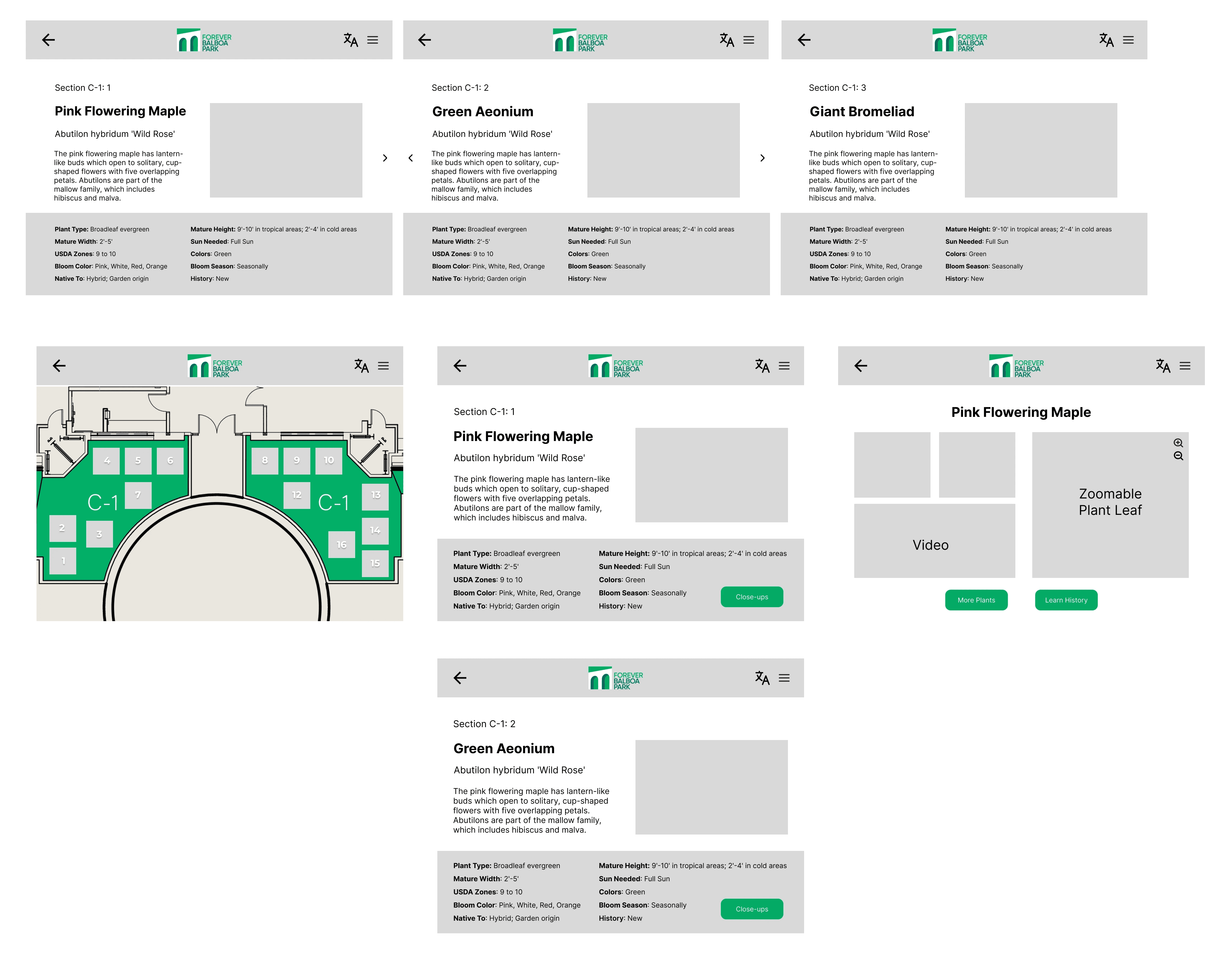
Based off the user journeys, I quickly sketched the prototypes and then created mock-ups on Figma.
PROTOTYPING
Iterations: plant information
After creating the prototypes, we conducted 3 moderated usability tests to see how users would navigate the plant information, building architecture, and scrapbook features. I made changes based off the user feedback and issues.
Before

After

Iterations: scrapbook
Before
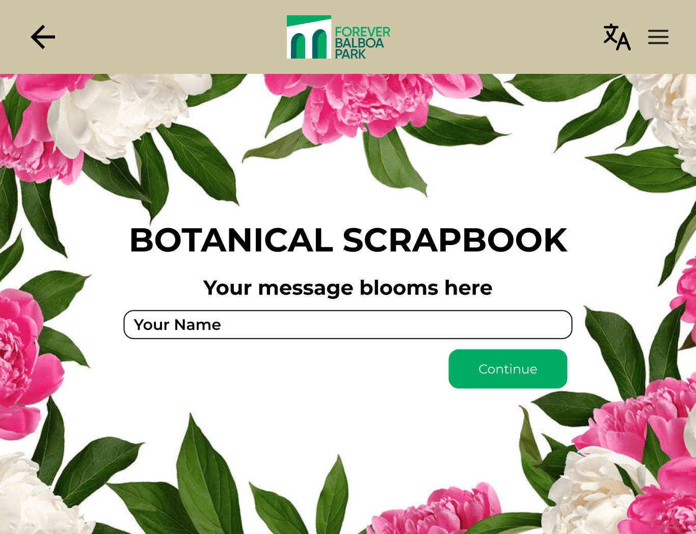
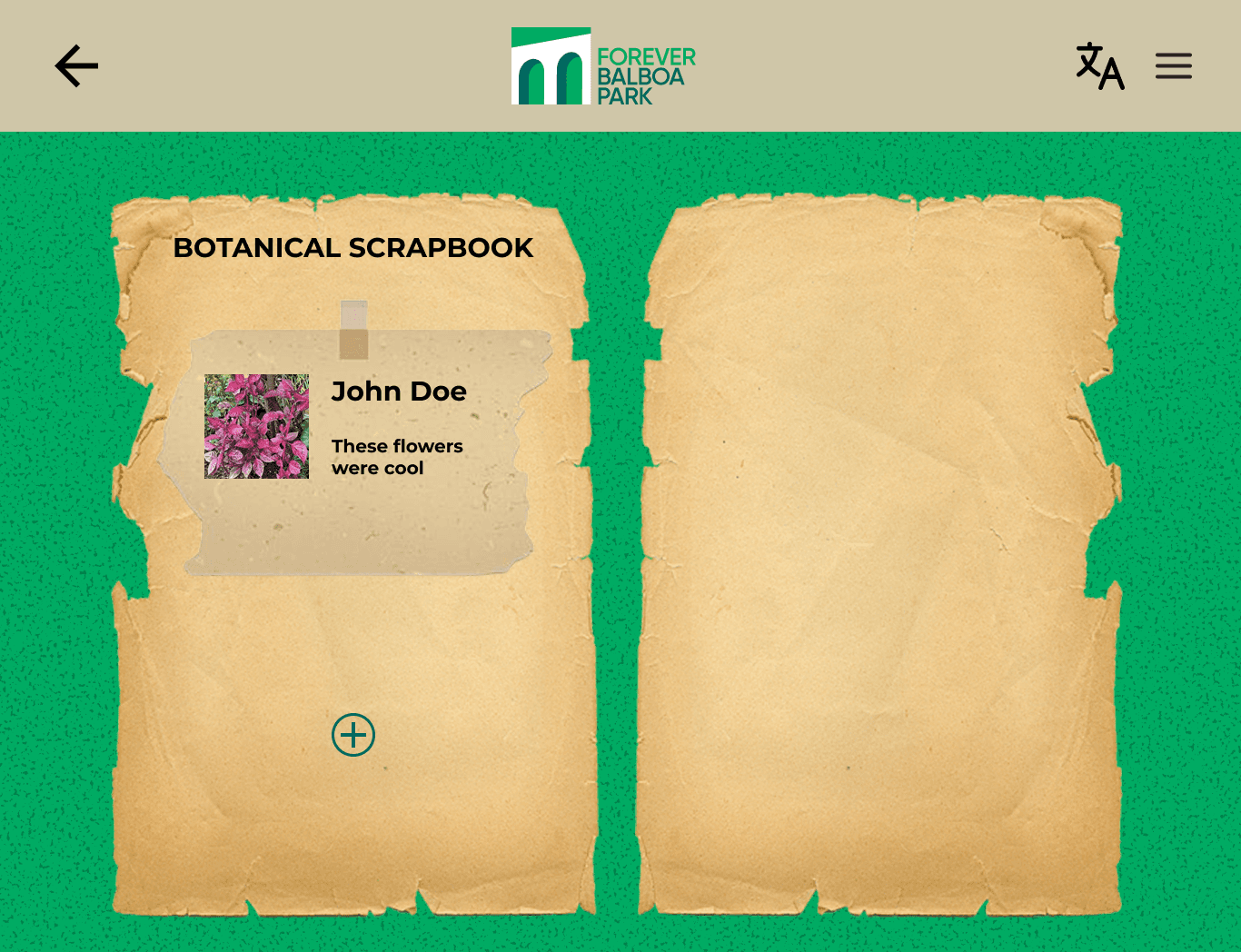
Scrapbook was disengaging, and not purposeful or memorable. Book texture also needed improvement.
After
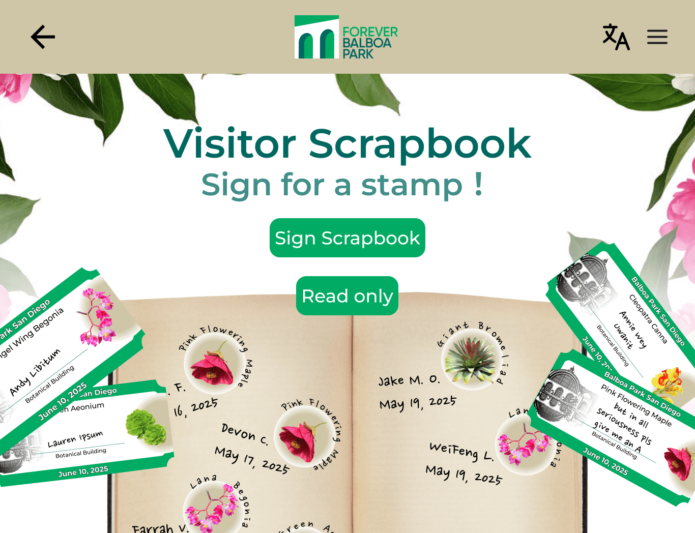
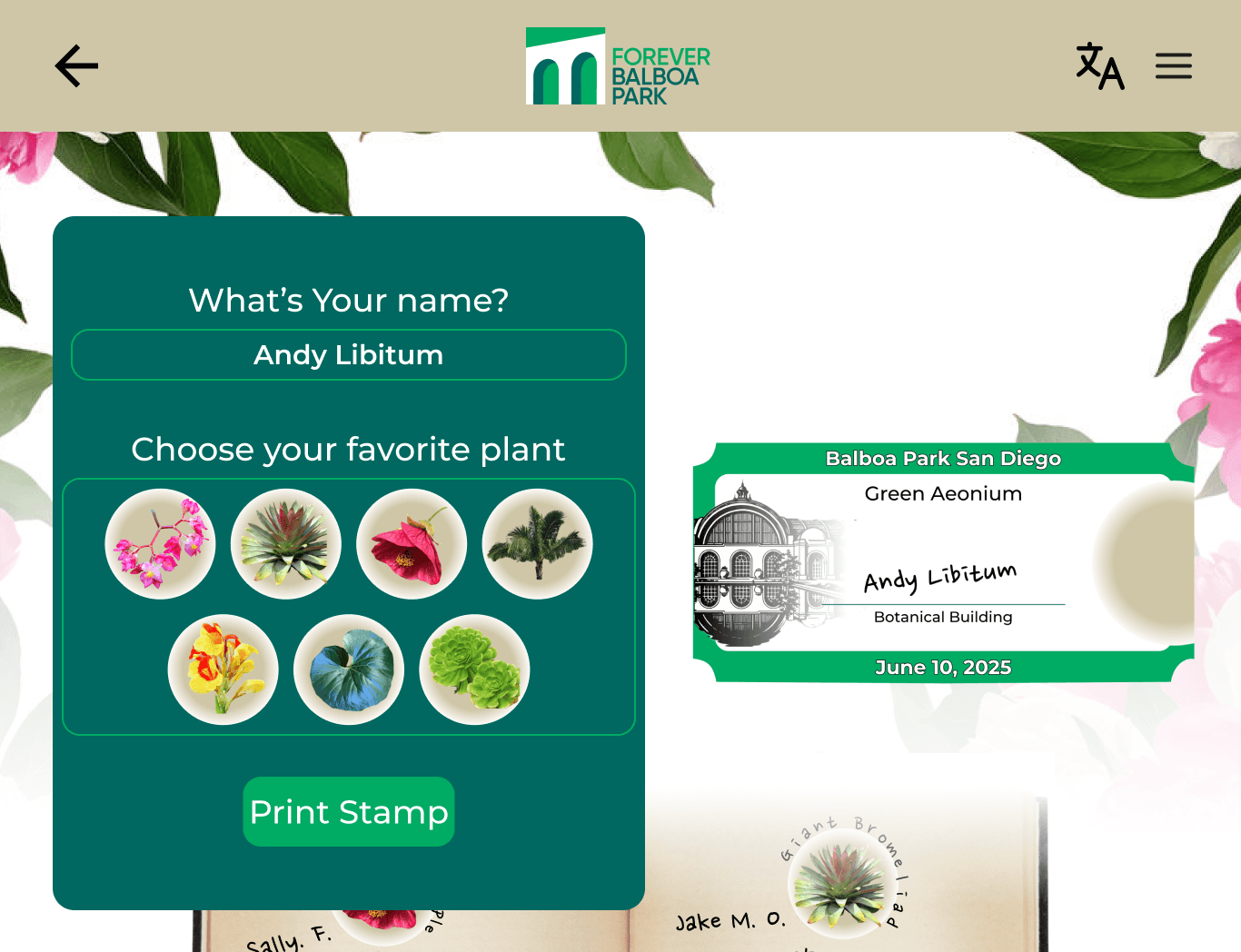
Scrapbook now emmulates physical stamp printing results for emotional engagement and motivation
High-fidelity features
Plant information
Building & Architecture
Scrapbook
REFLECTION
Have clear and succinct user journeys
User journeys establish the foundation for well-structured, detailed interactions. By mapping these journeys clearly, I could anticipate user needs, remove friction points, and create seamless experiences.
Photo spot suggestion as a main feature
This feature was part of the building architecture flow to motivate interaction with physical surrounding. From usability tests, it was hidden and participants indicated photo information should be advertised on the home page.
Collaboration through clear communication
Each week involved many iterations and revisions, making it essential to present updates and clearly explain major design decisions and updates.

