


Brewing a digital cafe experience for The Keep Coffee
A website for a modern, Asian-inspired San Diego café to discover the brand story, explore the menu, and easily order items.

THE PROBLEM
The Keep Coffee's website is limited to online ordering
The current website only supports online ordering through a basic Square template, lacking key pages to showcase the brand’s story and identity. With incomplete visuals and missing imagery, the website provides a limited and disconnected user experience beyond placing an order.

Original website, Apr 2026
MY GOAL
Replacing a bare-bones ordering page with a full digital brand
Goal #1
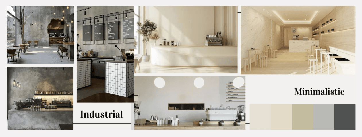
Translate Keep Coffee's existing industrial and minimal brand identity into a cohesive digital experience
Goal #2
Communicate the café's story, cultural background, and unique drinks to attract new customers
Goal #3
Design with the primary users in mind: curious, aesthetic-driven students looking for a new study or social spot
UX RESEARCH
Getting to know the owner and customers

Client objectives - affinity map
To understand more about the brand and mission, we interviewed The Keep Coffee's owner, Pam. We identified key features, content priorities, and aesthetic direction to carry into the website design.
Customer objectives - personas
We interviewed 9 customers and people who go to coffee shops with a variety of coffee/matcha habits and preferences, organizing our findings into 3 personas who would visit The Keep Coffee's website.

No centralized place to find it all
Based on all research and interviews, there were 4 pain points.
Pain Point #1: Menu
Menu information lacks clarity as customers wanted images, flavor descriptions, and pricing visible upfront
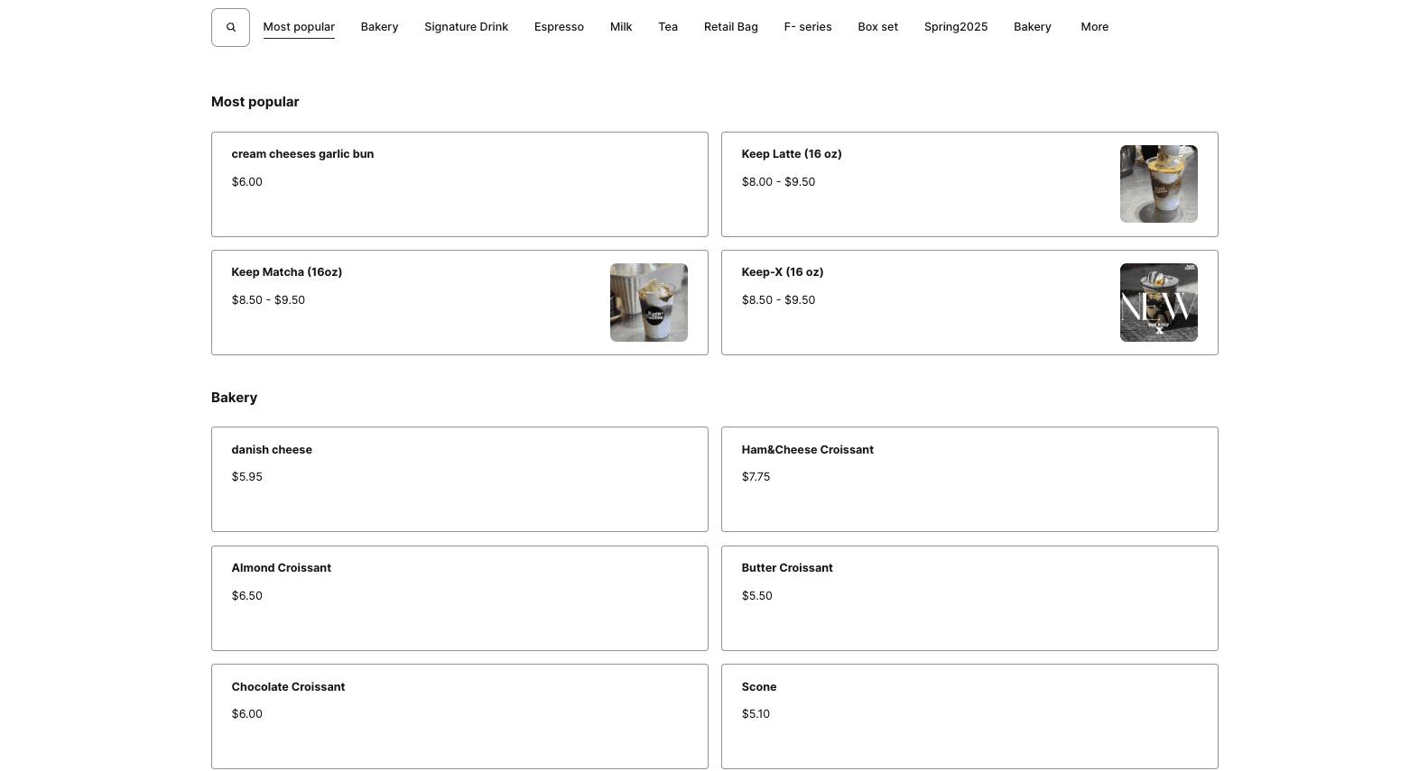
Current ordering page that only includes item name and price
Pain Point #2: Seasonal offerings
Seasonal drinks are hard to track, leaving customers dependent on finding them through social media posts

Need to find Instagram account and scroll to find seasonal posts
Pain Point #3: Ammenities
Wi-Fi, outlets, and seating aren't mentioned online, forcing users to take a risk, rely on word of mouth, or search on Yelp

Need to search on Yelp to find images of the interior
Pain Point #4: Coffee beans
Missing coffee bean descriptions leave enthusiasts without the necessary context to make a choice
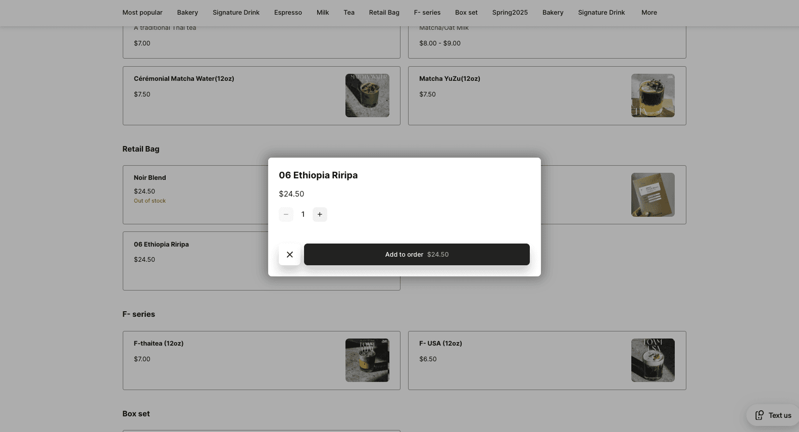
Current coffee bean cards lack image and descriptions
LOW-FIDELITY PROTOTYPING
Fixing the broken navigation
I first addressed the navigation of the website, ensuring the information architecture was intuitive.

Handling the content design
Next, we created low-fidelity prototypes for each page. We created different explorations before committing.

THE DESIGN SYSTEM
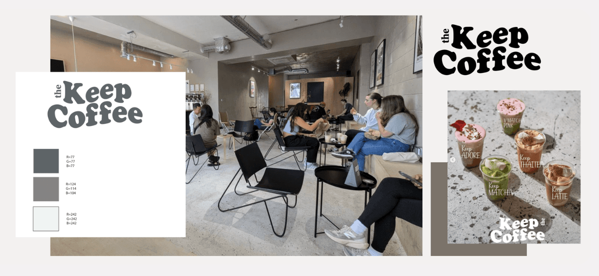
Building the design system from the moodboard

PROTOTYPE ITERATIONS
From feedback to final
After creating the first prototypes, we conducted usability tests with 4 people who enjoy visiting coffee shops to evaluate how intuitively users could navigate the website and find café information, browse the menu, and place an order. I changed the designs based on the feedback.
Homepage (desktop)

Menu (mobile)

THE FINAL WEBSITE
Everything in one spot
Since the client will be managing the website by herself, she does not have the capacity to have engineers develop the website. We used Wix to build and manage the website. Showing the mobile site as customers are more likely to use their phones.
Home
About
Menu
REFLECTION
Key takeaways
Balancing client and user needs
Designing for a client meant balancing between the client's vision and what users actually needed, even if the two don't always align.
Building a brand from the ground up
With no formal brand guidelines beyond a logo, we had to create an entire visual system from scratch. This pushed us to be intentional with every design decision.
Practical information can be just as persuasive as visuals
Amenities, pricing, and hours had just as much influence on a user's decision to visit as the aesthetic of the site. A reminder that function drives conversion.

Some of the menu items we got to try :)