


PROBLEM
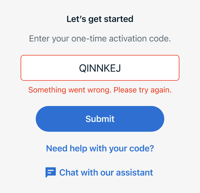
When users can't move forward
MY GOAL
Improve access to in-app support
Create a scalable, AI-powered support experience that delivers assistance across key Routely touchpoints. By integrating chatbot entry points, the experience enables faster issue resolution and makes support more accessible.
How might we provide support at the moment when help is needed?
How might we help customers resolve issues more independently?
How might we provide contextual guidance without disrupting the user experience?
FINAL SOLUTION
AI digital assistant
I designed an AI-powered chatbot experience that provides in-app support during activation and troubleshooting. The high-fidelity prototypes were handed off to engineering team for implementation.
FLOW POINT 1
Contact us
The chatbot option is added with the existing phone and email support channels, providing faster assistance. Customers can get help through an in-app conversation without needing to leave the experience.
FLOW POINT 2
Activation code
The AI assistant is introduced at the activation code screen, allowing customers to get help before entering the app. Instead of relying solely on the existing FAQ drawer, customers can quickly resolve activation-related questions and continue onboarding.
UX RESEARCH & AUDIT
Establishing a baseline before redesign
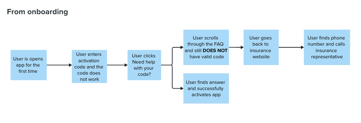
Pain points were identified through existing business priorities and stakeholder feedback. Before designing anything new, I audited the existing system by understanding how current users seek help.

Need help? Make a call.
Based on customer feedback, users had frustrations with having to contact an insurance representative by phone or email when they needed immediate help.

Not every issue fits an FAQ.
The FAQ only has known activation questions, creating a gap for users whose problems fell outside of the predefined scenarios.

PROTOTYPING
Chatbot UI iterations
I explored different ways of how the messaging should be displayed.
Version 1

Version 2

Final Version

TESTING
Testing and aligning with stakeholders
After refining the user flows and UI, I met with the product manager and developers to evaluate the best approach for the two chatbot flows. I walked the team through each flow, gathering feedback to ensure the designs aligned with user needs and technical requirements.
Starting from onboarding
Version 1
Drawer chatbot
By appearing as an overlay on top of the activation screen, users can quickly access help, dismiss the chat when they're ready to continue, and return to the conversation later without losing their chat history.
Version 2
Full-screen chatbot
This approach dedicates the entire screen to the conversation. Users can focus on resolving issues without distractions, but they need to leave the flow before returning to onboarding.
Everyone preferred the first version because being able to close the drawer allowed them to quickly go back to onboarding. If they had more issues, they could reopen the drawer back that still had the existing chat history. This balanced immediate access to assistance with the primary goal of completing activation.
Starting from home
Version 1

Early designs included a homepage chatbot entry point and an introductory screen explaining the chatbot's capabilities. After stakeholder feedback, both were removed to help customers reach support faster and reduce unnecessary friction. Since the chatbot was intended to support customers only when needed, stakeholders felt it was more effective to surface it contextually rather than prioritize it on the homepage.
Final Version

IMPACT
Moving to implementation
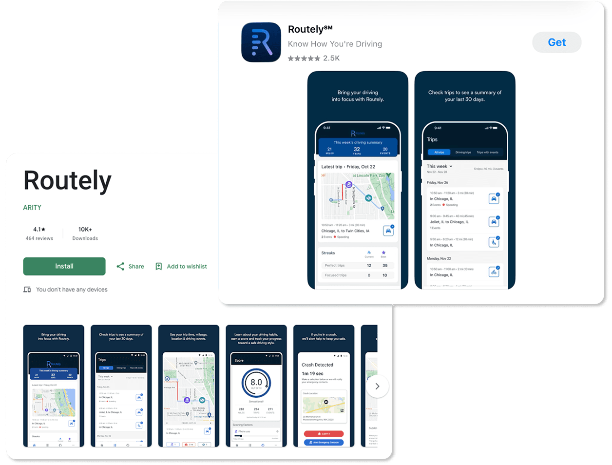
The design was successfully handed off to the development team and is being implemented in the Routely app. Routely is used by companies such as National General, Southern Farm Bureau, and Allstate, improving how users access support.
A multi-step process into a simple, in-app interaction
Before
Users need to email or call their insurance companies or scroll through a long list of FAQs
vs
After
Users get immediate answers to commonly asked and personalized questions
REFLECTION
Key Takeaways
AI should complement, not complicate the experience
I focused on making interactions feel intuitive and integrated into the existing workflow so that users could access support without feeling overwhelmed.
The balance of user needs with business constraints
I collaborated with stakeholders to design solutions that were intuitive for users while remaining feasible to implement and aligned with organizational goals.